

Coronavirus.
COVID-19.
Isolation.
Quarantine.
Wash hands.
Nowadays, these are the words that take up more room in our lives.
On television, on the Internet, on social networks, in newspapers or on the radio, the media coverage of this event has been widely extended and discussed. However, this scale of news can often lead to misinformation and, unfortunately, to speculation.
In order to fight this misinformation, many institutions and government agencies rely on images - diagrams and graphs - that visually translate the abstract data that is so talked about on occasions like this. These graphical representations allow creating connections between data, facilitating its understanding.

One of the areas of knowledge that develops this type of systems is Information Design. Design as a discipline based on the culture of the project and Information as the essence of communication, and communicating is the exchange and sharing of information between interlocutors.
Information is at the base of Knowledge, which is generated from giving meaning to data which, in itself, does not contribute to clear and objective information. Design then makes its appearance here, as an interface, for this translation of abstract data into visual systems, which are transformed into Information and, subsequently, generate Knowledge. Design is the agent that encodes and structures large amounts of previously disorganized data in structured information that can be interpreted by a socially and culturally linked audience.
On 4 March, the World Health Organization declared the outbreak of COVID-19 as a “pandemic”. This outbreak that started in the Wuhan province in China has spread to almost the entire world, and the focus is currently on Europe.
Many pandemics have plagued humanity throughout history (as can be seen from the graph below), however, contemporary society has never faced an invisible enemy.
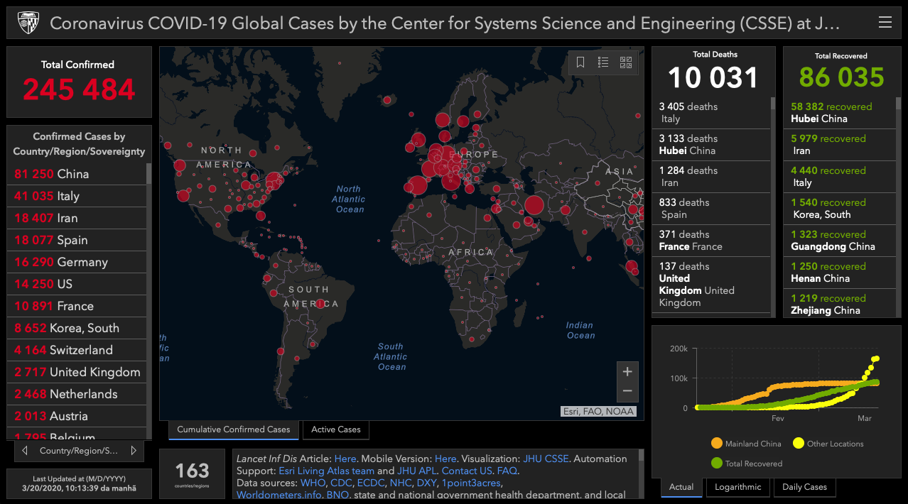
Coronavirus COVID-19 Global Cases, Center for Systems Science and Engineering (CSSE) at the Johns Hopkins Coronavirus Resource Center, 2020
Nowadays, there is something that transforms society’s perception of this pandemic: traditional media, the Internet and social networks. There is easier access to unstructured data or false information. However, there are also numerous projects that use the digital medium as a way of disseminating reliable and accurate information. Like the example below, which has been one of the main sources to monitor the evolution of this pandemic. One of the main sources to monitor the evolution of this pandemic.

Pedro Duarte Almeida is a professor of Information Design at the Faculty of Fine Arts of the University of Lisbon and belongs to the group of lecturers of the postgraduate course in Information Visualization, a partnership between the Faculty of Fine Arts of the University of Lisbon, the School of Sociology and Public Policy and ISCTE's School of Technologies and Architecture.
With this interview, we seek to gather knowledge of an area that most of the time goes unnoticed by those not paying attention. We want to understand how to communicate something as dramatic as what we are experiencing, but still in an appealing and reliable way, knowing that the goal should always be to inform, trying to do it with a positive impact on people's lives.
Never before have there been so many digital resources that show, in real time, data about an epidemic that is plaguing the world. Nowadays, we no longer only contact the people closer to us, but we can follow the evolution of contagion on a global scale. How can this amount of resources change the perception of a pandemic? Does more information equate to more knowledge?
Pedro Almeida: The ease of access and the volume of information that we access today has an inevitable influence on the way we observe and understand this or any other phenomenon. The perception and understanding we make of reality are based on the information we access. However, it is important to understand that information is, say, the 'raw material' of knowledge. In other words, what we consider to be known is the result of the perceptual processing and cognitive work that we constantly do from the information that we obtain in different forms and in different media - images, text, sound, etc. As such, more information leads to more knowledge. But it can also have a perverse effect. Information overload can lead us to what Richard Saul Wurman, one of the pioneers of information design, defined as informational anxiety. Wurman defined this 'pathology' in the late 1980s, recognizing the impact that the exponential production of data resulting from the digital revolution would have on the formation of knowledge in the future. Today, this anxiety manifests itself when our expectations of knowledge come up against the inability to deal with the ‘overwhelming’ amount of information we have available on any topic. In this sense, having access to this vast amount of information about the Covid-19 pandemic contributes, so that, in principle, we can have a greater and better knowledge of this phenomenon. But this implies that, on the one hand, the information we use is accurate and reliable and, on the other, that we have the means and time necessary to digest it and extract the best knowledge from it.
Often, the information that is conveyed is tragic or catastrophic. How can more dramatic information be communicated, when many still associate design with appealing/positive images? Can the abstraction of data at a visual level remove the emotional burden of what is being transmitted?
Pedro Almeida: I begin by deconstructing a certain idea of 'design' arising from the question raised. For a long time, the designer was seen as a professional, more or less eccentric, whose essential mission was to generate aesthetic appeal on the objects he drew, whether they were a lamp or a poster. I want to believe that this idea is outdated today and that a large part of the public understands the essential role that designers play in the design of things and the relationship we establish with them - just look around and see that we live surrounded by artificial objects that necessarily had to be conceived, designed and produced by someone. Gui Bonsiepe, a German designer who has published a large theoretical work, proposes a definition of design that is very simple, but at the same time very comprehensive, which I always share with my students: design as an interface between user, instrument and proper use. This triangle places design in the domain of ‘functional performance’, which necessarily incorporates an aesthetic dimension, but which fits both the design of the lamp and the design of the poster I referred to. That is, it can also be applied to information design. And here I get to the heart of the matter. And yes, the abstraction of the data can generate a 'dehumanization' effect of the information design. In this specific context, in which information has to flow at great speed and quantity, I think that this is inevitable. That is, when we look at the multiple maps and graphs that show us the numbers of victims of this pandemic, we can momentarily disregard that each number there corresponds to someone who is infected or lost his life. But, right away, this is the price to pay for having visual analysis and communication tools at our disposal that reveal the broader reality of numbers and allow professionals to make informed decisions as quickly as necessary. However, I believe that, over time, data visualization works on this topic will begin to emerge and it will explore the tragic human dimension of this phenomenon.
Every day, the Directorate-General for Health discloses an Epidemiological Bulletin that summarizes the evolution of the number of contagions in Portugal in the last 24 hours. Together with the Ministry of Health, they implemented a communication strategy according to which data is transmitted only once a day, in the morning. This Bulletin has a striking image and is easily recognized by all. As a professional in this area, what is your opinion about the strategy and means adopted?

Pedro Almeida: In a context of global crisis like this, I believe that public authorities' communication must be transparent, regular and frequent and the information must be very clear, concise and accurate. This becomes especially important in a scenario where social networks have become an ideal territory for misinformation... In general, the strategy adopted to communicate daily with the public through synthetic newsletters seems to be adjusted and the means of communication used also reveal a certain care with visual clarity and informative inclusion that I think is remarkable. The graphic simplicity and the constant presence of a sign language translator at press conferences are significant examples of this approach. However, there is one aspect that I think should be reconsidered and that is related to the public availability of scientific data. With privacy safeguarded, I think that disclosing this data could give rise to exploratory projects that would make a positive contribution. I am referring specifically to the possibility of asking questions about the data through visualization methods that make it possible to discover patterns and trends, identify relationships, etc. For example, at this point, one wonders why the lethality rate is so low in Germany compared to other countries. An in-depth exploration of the data can answer these questions and provide clues so that other countries can adapt the same strategies. I want to believe that at the 'central' level this work is being done, but it would be beneficial to encourage wider contributions in this area.
Early in the training of a designer, one learns the importance of choosing the most symbolic visual elements, but at the same time representative, of what is intended to be transmitted. On a global scale, the challenge is different. The information that is transmitted reaches the entire world and, at the same time, different societies and cultures with different perceptions of colour and shape. What is the importance of choosing these visual elements in communicating the evolution of a pandemic?
Pedro Almeida: In a scenario where information has to flow on a global scale, it is essential to look for symbolic elements that are widely recognizable. However, it is necessary to take into account the specific connotations that these gain in specific cultural contexts and which can be problematic. I believe that the use of pictography is very advisable in this scenario because these elements make it possible, within certain limits, to overcome linguistic and cultural barriers and communicate basic messages very effectively, even to audiences with lower literacy levels. Otto Neurath, who idealized and implemented the Isotype pictogram system in the 1930s, anticipated this same potential when he suggested that “words divide, images unite”! Another fundamental resource to be explored in this context is audiovisual communication and animation.
Many organizations and institutions rely on images and graphics to unequivocally transmit new data about the outbreak of COVID-19. The World Health Organization encourages hand washing, the National Health Service actively invests in social networks and the same happens in the Directorate-General for Health . In all these cases, it is possible to observe visually appealing images, produced and edited by designers. Can this affect the design discipline paradigm in some way, as an intermediary for the transmission of information? How can designers help healthcare professionals and authorities to communicate often complex information?
Pedro Almeida: This pandemic unmistakably reveals the need for greater and better collaboration between designers, authorities and public health professionals. An outbreak like this, but also issues such as the prevention or screening of certain diseases or the promotion of healthier lifestyle habits are fertile ground for this collaboration to be established and deepened. Involved in multidisciplinary teams, information designers can make a very important contribution, on a more general level (I would even say, political level!), regarding the strategic orientation of communication and, on a more specific level, the structural organization of information and the choice of more tuned representation methods to communicate the messages that are needed. This is especially relevant in the area of health, where the efficiency and effectiveness of communication can be a matter of life and death, as is happening now.
Has everything we have experienced, with communications after communications, graphics, slogans and marketing adapted to the new strategies to reach others, change your own teaching perspective?
Pedro Almeida: Teachers, due to the specificity of their task (and, in general, all of us) must be aware that we operate in an economy of attention. In other words, our discourse, the information we seek to share with students with the essential purpose of increasing their levels of knowledge and critical skills, is in competition with a multiplicity of other stimuli and information requests to which we are all constantly subject. For those who teach, this implies a great effort to adapt the contents, i.e., bringing them closer to thematic contexts that are easily recognizable (for example, in the last weeks, all Information Visualization classes involve the analysis of one or several cases related to the pandemic). It also requires an exploration of pedagogical strategies that encourage students to experience a learning process that is engaging and participatory, in which they are not mere recipients of information but participating agents in a communication process. Obviously it is a complex challenge, but it is also very rewarding when, after some time, we can see the intellectual growth and professional career of some of our students.
N.B: This interview was conducted by email
Catarina Monteiro
Editorial Team